Differences in heat energy (as measured by temperature) can be difficult to visualize. Combining scientific data with visual information, such as color, can help.
The weather map displayed on the news, Internet or newspaper, is a good example. A color scale provides information about temperature ranges across a given location (state, nation, or region).
A related technology, called thermography, uses cameras to detect infrared radiation given off by an object. Infrared radiation is emitted by all objects based on their temperature, so the resulting image (called a thermogram) allows one to see variations in temperature. Also known as thermal imaging, the technology has been used in a variety of ways: at airports to detect swine flu cases during the 2009 pandemic, by firefighters to see through smoke and locate persons, by maintenance workers to identify overheating parts and heat leaks, and in studies of physiological processes in humans and animals.
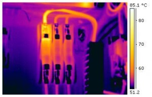
How does one interpret a thermogram? Consider this image of an industrial electrical fuse block (courtesy Wikimedia Commons).
In any thermogram, the brighter colors (red, orange, and yellow) indicate warmer temperatures (more heat and infrared radiation emitted) while the purples and dark blue/black indicate cooler temperatures (less heat and infrared radiation emitted). In this image, the bright yellow area indicates the electrical fault.
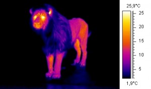
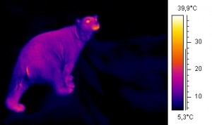
Compare these thermograms of a lion (top) and a polar bear (bottom) from Wikimedia Commons.
The image of the lion shows that heat is released from most of the animal, excluding its thick mane. The eyes, ears, and belly of the lion release the most heat and are therefore the brightest colors. In contrast, the polar bear’s extremely thick fur is an excellent insulator, so most of its body is dark. Only the face is an area where heat is released.
While students don’t have access to thermal-imaging technology, they can apply the same principle to study temperature differences in their classroom, school, or home – and begin to investigate energy efficiency!
CREATING A CLASSROOM ‘THERMOGRAM’
Before beginning this activity, students should be familiar with the idea that color scales can represent temperature ranges. If needed, bring in color weather maps to share with the class.
To create a “thermogram” of the classroom, a teacher (or students) should first create a simple map of the classroom, including doors, desks, vents, and windows. Teachers should photocopy this map so that all students have a copy.
Next, students need to gather temperature data from various locations in the classroom. Teachers might elect to do this through whole class activity, small groups, or individual students, depending on the allotted time and student comfort with using thermometers. Data should be collected from as many different points in the classroom as possible – near windows, the door, the board, computers, desks, and so forth. Teachers may wish to create a large data chart to display the temperatures. Students can then use a pencil to lightly record temperatures on the appropriate locations on their map.
Once the data have been collected, the class should create a temperature scale and assign colors to each temperature. Students then color in the map of the classroom accordingly. If this is too challenging for students, teachers could create a single class map on butcher paper, an interactive whiteboard, or an overhead projector, or by using a document camera.
Once the map has been created, ask students to analyze the data. What areas are warmest in the classroom? What are the coldest? Why do they observe these types of temperature differences? This discussion can lead into an investigation of insulators or a discussion of energy efficiency in schools and homes.
In addition, for upper-elementary students this classroom thermogram can be another introduction to the color imaging that they will encounter later in science textbooks.
This article was written by Jessica Fries-Gaither. For more information, see the Contributors page. Email Kimberly Lightle, Principal Investigator, with any questions about the content of this site.
Copyright December 2009 – The Ohio State University. This material is based upon work supported by the National Science Foundation under Grant No. 0733024. Any opinions, findings, and conclusions or recommendations expressed in this material are those of the author(s) and do not necessarily reflect the views of the National Science Foundation. This work is licensed under an Attribution-ShareAlike 3.0 Unported Creative Commons license.


