Katy Farness has a unique job. She has helped to create some of the most accurate and detailed images that exist of Antarctica! She has also helped to create detailed images of Greenland’s massive ice sheet and, more recently, the movements of specific glaciers at both poles. It takes months to years to create these images, and as soon as they are published, they are in great demand by scientists around the world!
Researcher: Katy Farness
University/Organization: Byrd Polar Research Center at The Ohio State University
Research Location: Columbus, Ohio (and Greenland!)
Measuring Ice Sheets and Glaciers
In 2005, Katy went to Greenland to help set up some of the equipment to measure changes in ice characteristics. She was on a team that was setting up the Global Positioning System (GPS) units, like those in the navigation system of your car, to determine the position of the ice sheet. The team also took measurements of the thickness of the ice sheet. Their measurements are being compared to measurements taken in previous years to determine movement of the ice sheet over time as well as changes in ice thickness. The measurements play a key role in climate-change calculations and predictions.

Although this photo shows Katy enjoying a cup of coffee in a snow pit, as if she’s on vacation, we should remember that conducting research on a glacier can be difficult and sometimes risky work.
You may have read about an international report issued in February 2007 that described the likely effects of climate change. It was the fourth report produced by the Intergovernmental Panel on Climate Change (IPCC) since 1991, and was authored by a group of some 300 climate scientists from more than 100 countries. The panel shared the Nobel Peace Prize in 2007 for its reports over the years.
At the time of the 2007 report, IPCC scientists said they needed more information in order to predict with confidence the effects of changes in Earth’s great ice sheets, covering Antarctica and Greenland. The National Science Foundation’s Science and Technology Center for the Remote Sensing of Ice Sheets (CReSIS) is working hard to measure, describe, and map the changes in these vulnerable regions. Katy and other researchers at Byrd Polar Research Center are part of that effort. They are helping to provide information to the IPCC’s climate scientists.
Research In Extreme Conditions
As you can imagine, the polar regions are difficult to study because the winter months are dark, it is extremely cold year-round, and, in the example of Antarctica, the extreme conditions create a dangerous place for humans to work. As a result, scientists rely heavily on data that are gathered by instruments (called “sensors”) carried by satellites, planes, and ships, which serve as “platforms” for the instruments. Cameras are often used as sensors. They provide photographs from the reflected visible light. Some of the sensors, however, can detect wavelengths of energy that we cannot see, such as X-rays, radio waves, and ultraviolet and infrared energy. Because light is not necessary to create these types of images, the sensors can gather information through cloud cover, smoke, and haze, and can even capture a good image at night.
Using satellites to gather information from the polar regions is a good use of this technology. It reduces the need for humans to endure harsh environments and can obtain information not accessible to scientists from the ground. Also, because the instruments record data several times a day, every day, for the life span of the satellite, scientists can detect and describe daily, monthly, and annual cycles that might not otherwise be observed. Additionally, because satellites are far from Earth’s surface, the cameras or other instruments can image large areas of Earth at one time. As a result, satellite images are particularly useful for studying the whole Earth.
There are two basic types of orbits for satellites. Some satellites orbit at exactly the speed of Earth’s rotation; they appear to hover above a particular location as Earth spins on its axis. They are called “geostationary” satellites. Others, known as “polar-orbiting satellites,” circle the Earth from pole to pole several times a day. As a result of this orbit, the Earth literally spins beneath the satellite as it travels. The “swath” (or path of the area that was viewed from the satellite) appears to be curved because of Earth’s rotation.
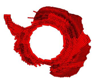
Swaths of Antarctica created by satellite flyovers (1997)
The image of Antarctica with the red lines shows the swaths created by many flyovers that occurred between September 19 and October 7, 1997. As you can see, it took many sets of images (over 5,000 frames!) to cover the entire continent of Antarctica. Then it also took many years of computer work to obtain geographic accuracy, correct for any errors in terrain, and smooth and blend the edges of the swaths to create the final image mosaic. This final mosaic (below), which is used by researchers and scientists worldwide, has been recognized as the most accurate image of Antarctica to date.
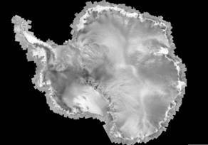
Final mosaic of Antarctica
Katy has helped with the processing of images that track the advance and retreat of Greenland’s and Antarctica’s major ice shelves and glaciers over time. This was accomplished by comparing coastline positions from a time series of images starting as early as the 1960s. The lines on the images presented below represent the margins of the ice shelves as they were recorded from satellite data in 1963, the 1970s and 1980s, 1997, and 2000. Katy is currently working on 2004 and 2007 Antarctic images as a continued effort to detect and describe changes there. She is also processing a set of images over four of Greenland’s glaciers, from 2000 to the present.
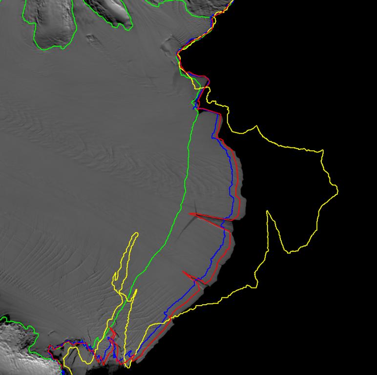
Changes in the Amery Ice Sheet from 1963 (yellow), 1971 (green), 1997 (blue), and 2000 (red).
The upper image shows changes in the Amery Ice Shelf from 1963 to 2000. The gray area represents the 2003-04 coastline. The lower image shows changes along a part of the Ross Ice Shelf for the same years.
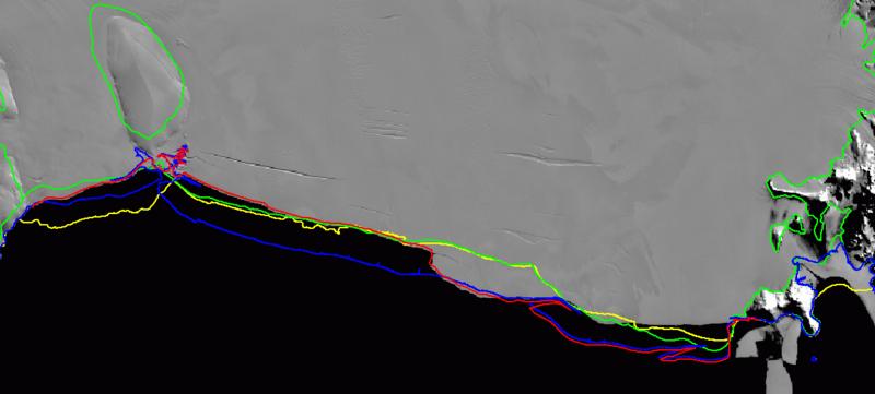
Changes in the Ross Ice Shelf from 1963 (yellow), 1971 (green), 1997 (blue), and 2000 (red).
We interviewed Katy and her colleague, Steve Mather, in 2007 to learn what she likes most about her job. If you can’t view the video below, you can watch it on YouTube.
This article was written by Carol Landis. For more information, see the Contributors page. Email Kimberly Lightle, Principal Investigator, with any questions about the content of this site.
Copyright March 2008 – The Ohio State University. This material is based upon work supported by the National Science Foundation under Grant No. 0733024. Any opinions, findings, and conclusions or recommendations expressed in this material are those of the author(s) and do not necessarily reflect the views of the National Science Foundation. This work is licensed under an Attribution-ShareAlike 3.0 Unported Creative Commons license.